Follow me on Twitter!


Friday, April 25, 2014

A Look Back at the 2014 Open: Part II

Note: For details on the dataset I am using, including which athletes are and are not included, please see the introduction to Part I. Thanks again to Andrew Havko for pulling the 2011 and 2014 data sets for me.

Welcome back. As I mentioned in Part I, the second part of my look back at the Open will deal more with the results of this year's Open. Much like in Part I, I'm also going to be putting things in perspective by making some comparisons to past years.

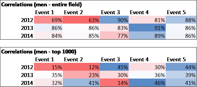
So let's start part II by looking at the event correlations, which is one way to judge how effective each workout is for measuring overall fitness (see "Are Certain Events 'Better' Than Others" from 2012 for more explanation). The charts below show, for the 2012-2014 men's* Opens, the correlation between each event and the sum of ranks for all other workouts in that season. Remember, correlations range from -100% to 100%, with 100% meaning that a higher rank on an event always indicates a higher rank across other events and 0% meaning that there was no relationship whatsoever between the rank on an event and the rank across other events.


Not surprisingly, event 14.4 was most correlated with overall success this year (both looking at the entire field and the top 1,000 only). We've seen in the past that events with more movements typically have higher correlations, although there have been several couplets with high correlations (13.4 for instance). Note that two of the weakest correlations were for 12.1 and 12.2, both single-modalities. We also notice that 14.3 had a low correlation, which probably doesn't come as a shock to most of us who follow the sport closely. That event basically boiled down to a heavy deadlift workout, and consequently we saw relative unknowns like Steven Platek end up in the top 10 worldwide.

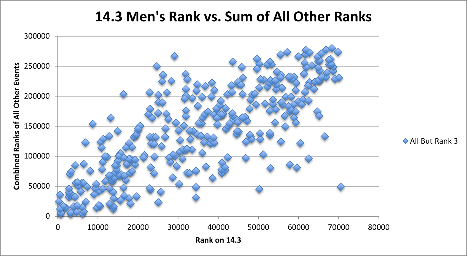
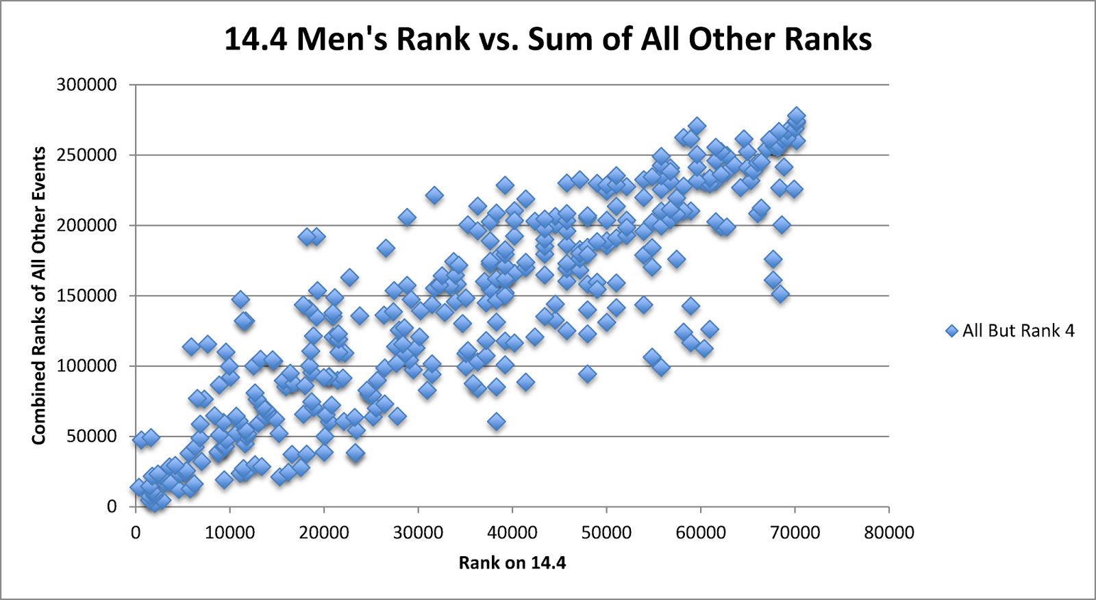
For those unfamiliar with with what the concept is, below is a visual representation. The first chart shows the relationship between 14.3 rank and the sum of all other ranks, and the second charts shows the relationship between 14.4 rank and the sum of all other ranks. Notice how the bunching is tighter for 14.4 - there are fewer athletes who did well on 14.4 but did not do well otherwise (these would be dots in the top left) and fewer athletes who struggled on 14.4 but did well otherwise (these would be dots in the bottom right).


The correlations were generally lower this year than in 2013, although they were higher than in 2012. Lower correlations aren't necessarily "bad" - the fact that 2014 had lower correlations than 2013 is partly due to the fact that the workouts were more varied, which I personally liked. I think they struck a nice balance this year between not having any events that were too specialized (like 12.1 or 12.2), but not having the same athletes finishing at the top of each event (which occurred to some extent in 2013). I think this was reflected in the point totals needed to qualify for regionals each year: in the Central East for example, the 60th place competitor scored 589 points in 2014, compared with 450 in 2013 (with approximately 65% of the competitors of 2014) and 508 in 2012 (with approximately 30% of the competitors of 2014). More variety in the events means that athletes can afford more points and still reach regionals.

Let's move on to a comparison of performance between new athletes and continuing athletes. The charts below show the average percentile rank (0% being first place, 100% being last place) of athletes in each event, split between athletes who finished all 5 events in 2013 and those that either did not compete in 2013 or did not finish all events.


Like last year, the returning athletes did fare much better than the newcomers, and the difference was consistent across all events (the gap is nearly identical to last year). This shouldn't come as a surprise. In fact, if we extend this further and look at athletes who competed all the way back in 2011, we find that they finished in approximately the top 25% for men and 20% for women.

This leads us to probably the most interesting analysis I have in this post: a comparison of 11.1 and 14.1. Last year, when I looked at 13.3 vs. 12.4, I found that overall, the field performed nearly identically across the two years. However, when we isolated this to athletes who competed in both years, we saw a significant improvement in 13.3.

So what about 14.1 vs. 11.1? First, I compared the results across all athletes who finished all 5 events in either year. Interestingly, the average score in 2014 was approximately 10% lower for both men and women when we look at the entire field. This supports my belief that the Open didn't really become "inclusive" until 2012, when HQ put a lot more effort into convincing the community that everyone could and should participate in the Open. The 2011 Open was intimidating also: event 11.3 required male athletes to be able to squat clean 165 and female athletes to be able to squat clean 110, or else they would get a DNF.

Below is a graph showing the distribution of scores in 11.1 and 14.1 for all women who finished all events in either year. The x-axis is shown in terms of stations completed, not total reps, because this accounts for the fact that each round has twice as many double-unders as snatches. A score here of 10 stations is equal to 5 full rounds or 225 reps. Note that the 11.1 distribution is skewed to the right, indicating more athletes with high scores.


Like last year, however, this only tells part of the story. If we limit our analysis to athletes who finished all events in both years, we see the improvement we expected. Female athletes who competed in both years scored approximately 23% higher in 2014, male athletes who competed in both years scored approximately 14% higher, and both men and women averaged an impressive 283 reps in 2014. Below is a graph showing the distribution of scores in 11.1 and 14.1 for women who finished all 5 events in both years. Now you can see that the 14.1 distribution is skewed to the right.


Another thing I looked into was the percentage of athletes who finished the workout on the double-unders. I used this as a proxy to see how the community has improved on the double-unders. The idea is that for athletes who are competent on double-unders, that station will be much shorter than the snatches, thus we should see fewer athletes finishing on the double-unders if the athletes are stronger in that area. I found the following:
  • Men (entire field) -  2011: 50.7%, 2014: 47.4%
  • Women (entire field) - 2011: 50.0%, 2014: 49.9%
  • Men (competed both years) - 2011: 49.3%, 2014: 41.3%
  • Women (competed both years) - 2011: 47.8%, 2014: 41.2%
Although I was expecting to see the percentage drop more for the entire field, the numbers do support my belief that the community has become more proficient at double-unders in the past three years. This is particularly true for athletes who have been competing each year.

Finally, I took a look at the attrition from week-to-week this season. The chart below shows how the field declined each week over the past four seasons. To reduce clutter, I averaged the results for men and women each season.


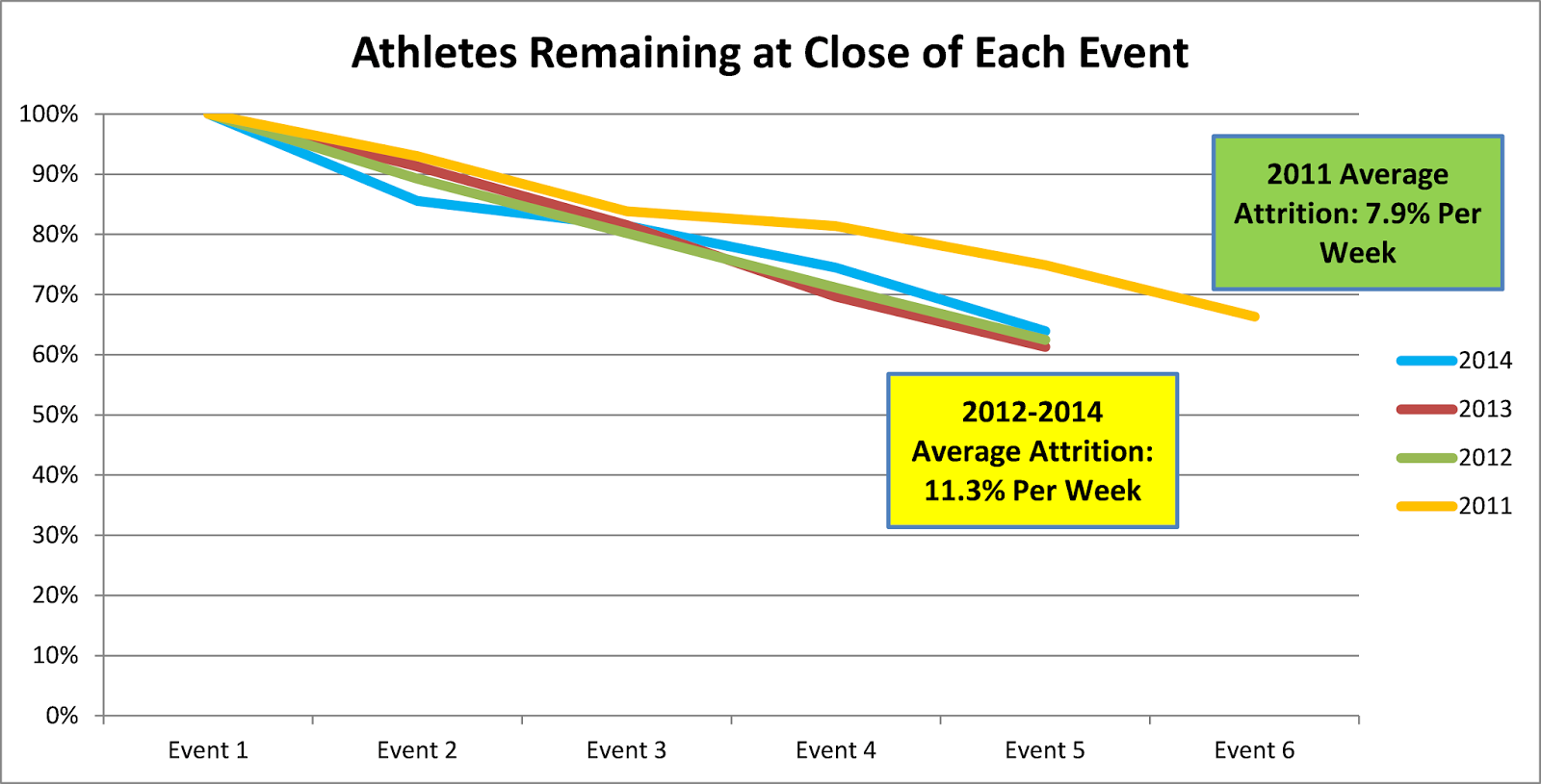
Again, we see that things shifted pretty significantly after 2011. As I mentioned earlier, I believe that there was a much smaller percentage of "casual" Open participants in 2011 than we see today. The chart above supports that. Fewer athletes dropped off that season because the athletes who chose to sign up were generally more committed to competing for the long-haul.

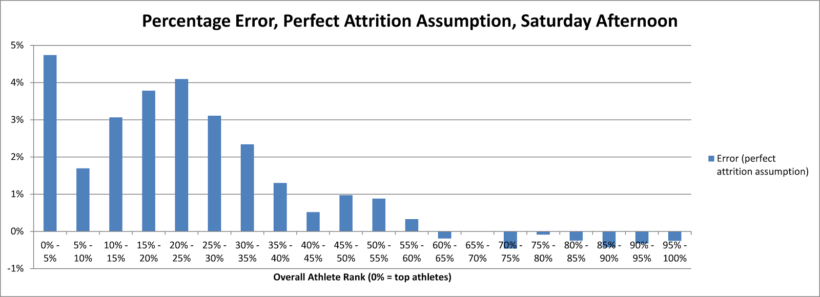
Since then, the men's and women's field has finished up with between 59% and 64% of those that completed event 1. The percentage dropping off each week has varied between 4% and 19%, averaging out to approximately 11%**.

Well that's it for today. I've covered a lot in these past two posts, but at the same time I think there is plenty more work that can be done with the Open data, especially now that I have all four years of Open data to play around with and compare. That being said, I think it's shift the focus to Regionals, so I'll see you all again in a few weeks.

*The women's correlations are very similar.
**11% would probably be a good place to start for the attrition estimate needed to do the mid-week overall projections (described in recent posts).

Saturday, April 19, 2014

A Look Back at the 2014 Open: Part I

As I did last year around this time, today I'll be starting my review of the 2014 CrossFit Games Open. Of course there will be limitations to what this analysis will be able to cover, partly due to the data I'm able to get at this point (I am hoping to eventually pull down all the individual stats, like Fran time, max deadlift, etc.). Still, I think there is enough data out there to help us further our understanding of the current state of our sport and where we may be headed. Like last year, I'll be breaking this post up into two parts. To start, here is a list of topics I plan to cover, followed by a list of things I will not be touching on in this post:

Will cover:
  • Breakdown of the programming of this year's Open, much like my "What to Expect from the Open" posts from fall 2012 and fall 2013 (Part I)
  • Correlations between events this year, compared with last year (Part II)
  • Comparison of performance by new competitors vs. returning athletes (Part II)
  • Comparison of 11.1 and 14.1 results (Part II)
  • Attrition in this year's Open, compared with past years (Part II)
Will not cover:
  • Comparison between regions (don't have region information on the data at the moment)
  • Breakdown by age group (don't have age information, either)
  • Predictions for regionals (coming in the next few weeks)
  • Probably lots of other subjects that I simply didn't think of. If you have suggestions for future analysis, by all means, post to comments or email me.
Finally, here are some notes on the data set I am using for any work dealing with the results of the Open (thanks again to Andrew Havko for helping me pull this data, along with the 2011 Open results, which I've been wanting to get my hands on for some time):
  • Excluded any athletes who did not complete all 5 events. This simply makes for fairer comparisons. I did look at all scores in order to calculate the number who dropped off each week, but that is it.
  • Masters competitors (54 and under, since older groups are scaled) are lumped in with everyone else. As mentioned above, I don't have age information this dataset since I pulled it straight off the worldwide leaderboard.
  • I have re-ranked athletes on each event among the athletes in this dataset.
  • Athletes were identified as returning athletes if their full name was in last year's dataset. There are multiple athletes with the same exact name, but I had no way around this without region or age information. I assume any impact here is minor. The one manual fix I made was to make sure the Ben Smith at the top of the leaderboard was matched up with the correct Ben Smith from last year's data. 
So let's get started.

We'll start with the programming this year. I generally liked the programming this year (although it certainly didn't play to my strengths), mainly because HQ finally threw us some curveballs and some workouts that I didn't expect. Among the things we saw this year that hadn't occurred in previous Opens:

  • Rowing
  • A workout for time (rather than AMRAP)
  • A workout with more than 3 movements
  • Weights over 300 pounds for men and 200 pounds for women
  • Pull-ups and thrusters not in the same workout

Having said that, the Open is still the Open, and many things remained the same or similar as prior years. For instance, the loading was still much lower than the Regional and Games level. In fact, by my measurements, this was the lightest Open yet. Below is a basic comparison of the average loading* used each year in the men's competition (the pattern is the same for women).


The average relative weight was down from all prior years and there less than 50% lifting, which meant that the load-based emphasis on lifting (LBEL) was down about 10% from the historical average**. An investigation for another day is whether this Open favored smaller athletes because of that lower LBEL.

Now let's take a look at which movements have been used across the three years, and how they have been valued. This is presented slightly different than last year: each value represents how much that movement was worth as a percentage of the total for that season. The reason for presenting it this way (as opposed to counting total events) is that 2011 had six events and the other years had five, so this accounts for the fact that each event was not worth as much in 2011.


We see that this year, the programming hit almost every movement that has been used at any point in the past (push-ups and jerks were the exceptions) and added one new movement (rowing). Not surprisingly, we see the same movements being emphasized as in prior years: snatches, burpees, thrusters and pull-ups. One interesting note is that this is the first year in which no movement has accounted for more than 10% of the total points. However, the caveat here is that this methodology assumes all movements in a given workout are valued equally. In reality, there are instances where this is not necessarily true: for instance, most people would agree the deadlifts were valued far more than the box jumps in 14.3

As in past years, you'll also notice that the Olympic-style lifts and derivatives (thruster, overhead squat), as well as basic gymnastics movements, were the biggest keys to Open success. However, we did see a bit more value placed on other areas, such as powerlifting (e.g. deadlift) and pure conditioning (double-unders, rowing). Although Castro did surprise us with a few things this year, I still think it's a safe bet that the more advanced movements you might see at the Games (e.g. ring handstand push-ups, heavy medicine ball cleans) are not going to be tested in the Open. That's not to discount the usefulness of these other skills in training; it's just that you're not likely to see that tested until at least the regionals.

Finally, here's a chart I put together showing the relationship between loading, the number of movements, and the length of workout in the past three years of the Open. This chart was shown last year, but I have added the 2014 workouts, which are represented by the red balls. In the chart below, the x-axis represents the time domain, the y-axis represents the number of movements*** and the size of each bubble represents the LBEL of that particular workout (roughly how "heavy" was each workout). A plus-symbol indicates the weight varied during the workout and the arrows indicate the time varied for the workout****.


This year's workouts, although unique in how they were programmed, still didn't stray too far from what we've seen in the past in terms of loading and time domain. Keep in mind that for the above chart, I'm using averages for the variable-weight event (14.3) and variable-time events (14.2 and 14.5). For many CrossFitters, they did see a very long workout in 14.5 (which took many people beyond 20 minutes) and a very short workout in 14.2 (which only lasted 3-6 minutes for a majority of the field).

You can still observe some general trends here, which are often true of CrossFit programming in general. The shorter workouts tend to involve fewer movements and can occasionally go heavy, while longer workouts can potentially involve 3 or more movements but generally have light-to-moderate loading.

That's it for Part I. In Part II, which I expect to be out this week, I'll be focusing more on the results of this season's Open. See you soon.


*For background on these metrics, please see my post "What to Expect from the 2013 Open and Beyond." You may notice that the loading for prior years has changed slightly, which is due to me updating the relativities between lifts as I gather more data.
**For any workout with a variable element, such as the weight in 14.3 or the time in 14.2 or 14.5, I used the average of the top 1000 athletes. This is consistent with prior years.
***I considered the 11.3 a single-modality for this chart even though it technically included cleans and jerks.
****Workout 13.5 is actually hidden from view here because 14.3 is covering it up (same time domain and number of movements). Workout 13.5 was also a variable-time workout and would have had the arrows on the ball.

Tuesday, April 1, 2014

Can Mid-Week Projections Work?

Two weeks ago, I proposed a method to project an athlete's overall ranking before score submissions had closed for the week. To me, it made sense on paper, but it was admittedly untested. So I put out a request for help on testing it in week 4, and thanks to Andrew Havko (among others), I was able to make that happen.

So can it work? It appears that it can. That's not to say the projections are 100% accurate, and they are far from precise very early each week. But I think it's clear that the projections can give an athlete a good sense of where they would likely finish the week if they stick with their current score, which is something that is nearly impossible currently.

I tested these projections at three points during week 4: Friday 8 a.m., Saturday 5:30 p.m. and Sunday 3:30 a.m. (all EDT). The method requires one key assumption, which is the percentage of athletes who will drop off from the prior week, and for this I used 10%. Certainly this would need a bit more careful thought if it were to be implemented by HQ.

For each athlete, I projected their overall worldwide ranking at each of these times. For athletes whose score did not change by the end of the week, I compared my projection to their ultimate ranking. In total, the error of my projections were as follows:
  • Friday 8 a.m. (<1% of field reporting) - 9,575 mean absolute error*, 9,404 mean error
  • Saturday 5:30 p.m. (16% of field reporting) - 1,003 mean absolute error*, -787 mean error
  • Sunday 3:30 a.m (21% of field reporting) - 1,454 mean absolute error*, -1,362 mean error
Interestingly, the projections (at least using this first basic method) got slightly worse overall from Saturday to Sunday. The reason is that the distribution of scores submitted by Saturday 5:30 p.m. was more similar to the ultimate distribution than on Sunday. What I found was that, in general, the scores submitted very early on during the week are well above average, and the quality slowly declines throughout the week.  That is until Monday evening, when a slew of athletes replace their first score with a second improved submission. It turned out in this case that Saturday afternoon was a pretty accurate indication of how the current week's scores will turn out.

However, let's look a little more closely at the errors. Although an error of 1,003 (our best mean absolute error) is pretty small for an athlete finishing, say, 40,000th, it would be a very large error for an athlete finishing 2,000th. Thankfully, the size of the errors generally increased as the ranking increased. Below is a chart showing the percentage error for athletes across the spectrum of rankings, using our Saturday afternoon projections.


So you see that generally, we never really stray further than 3% error at any point. That's not too bad when you consider that there's currently no way to get even a good ballpark estimate until at least mid-day Monday.

Still, maybe we can do better. What if we had actually used the perfect assumption (8% in this case) for the percentage of athletes who would drop off from the prior week?  Well, in total, we improve for our Saturday and Sunday projections, with the mean absolute error going down to 338 for Saturday and 581 on Sunday. Interestingly, though, in this particular case it doesn't necessarily improve the projections across the board for Saturday and Sunday. Below is the same chart as above, but with the perfect assumption for attrition.


Although our error gets a little worse near the top, once we get near the middle of the pack, these projections are nearly spot-on. And even near the top, a 5% error isn't that bad - that's like these projections putting Josh Bridges at 100th overall, whereas he actually finishes 105th.

One way we can theoretically adjust to get even closer is to make an adjustment for the skill level of the atheletes who have submitted scores at a given point. This could involve looking at the average ranking of the athletes from their prior week's scores and comparing that to what we'd expect by week's end. The trouble is, it's challenging to know what the level will be at week's end. You might expect that the field would average out to be at the 50th percentile in prior weeks, but that wasn't actually the case here. The average athlete submitting a score for 14.4 was actually about the 48th percentile in prior weeks, which is due to the fact that the athletes dropping out after 14.3 were generally from the bottom of the pack.

My point is that while such an adjustment is possible, it might not be practical. And considering the projections even with my base 10% attrition assumption weren't too bad, I don't think further adjustments are necessary, beyond refining that attrition assumption to make it as accurate as we can.

Finally, while I think this method would produce reasonable results if implemented by HQ next year, there are some caveats about the testing done here:

  • I've only done testing for one week. There may be more (or less) error if we made these projections in week 2 or week 5.
  • I'm almost certain that the percentage error would increase a bit if we do this for each region. The sample size is much smaller, which means that even if the same principles apply, we're likely to see more variability. For one thing, it's going to take longer each week before the projections are even remotely meaningful, since many regions had less than 100 entries until late each Friday afternoon.
  • I only tested this for the men's field. I don't see any reason why the results would be much different for women, aside from the field being smaller, which would likely increase our percentage error a bit.
All that being said, I feel that implementing this method would provide a realistic glimpse into where an athlete will wind up. As long as athletes understand that this is merely an estimate, the information provided can be quite useful. 

Would this revolutionize the sport? Of course not. But I think it would be yet another improvement to the athlete experience as the largest stage of our sport continues to grow.


*Mean absolute error is the average of our errors, if we ignore the direction of the error. So if we are off by -500 for one athlete and +500 for another, the mean absolute error is 500 but the mean error is 0.