First of all, thanks so much to Sam Swift for pulling the data for 2015 (as well as 2012-2014, which I have used to a lesser extent in this post). He also has some cool analysis on his page, and I suggest you check it out at some point.
For each portion of this analysis, I had to decide whether to include scaled competitors or not. Often, I excluded anyone who scaled any workout, so as to be more comparable to what was done in the past (when scaling was not an option). For instance, with the correlation between workouts, it did not make sense to include scaled competitors at all, as this mixed in scaled and Rx'd workouts and made for an apples-and-oranges comparison. Other times, however, I did include athletes who may have scaled some workouts. For instance, on the 15.2 vs. 14.2 comparison, I included all athletes who did 15.2 Rx'd, regardless of whether they did other workouts scaled. I'll try to note which population was used in each section.
So now for the results. I'll start with the correlation analysis that I've done many times in the past. This basically tells us which workouts were highly correlated with success across the board in that season. The charts below show the correlations for women from 2012-2015 (the mens' results are quite similar).
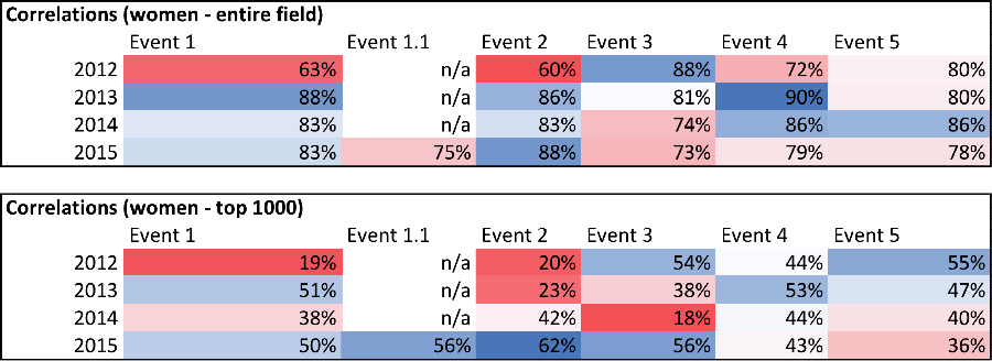
We see first of all that 15.2 was a pretty solid workout. Interestingly, it had a higher correlation this year than 14.2 did last year. You can see the same pattern between 12.4 and 13.3. My guess is this is due to returning athletes having a better feel for this workout, and since returning athletes typically do better in general, we see higher correlations.
What is very intriguing is the fact that 15.1a, the max clean-and-jerk, had a relatively low correlation for the entire field, but a relatively high correlation when we limit to the top 1,000 overall finishers. This would indicate that for the top athletes, the best-of-the-best perform quite well in a max clean-and-jerk. But for the entire field, this event didn't pick out the top athletes as well as the other events.
The scatter plots below, which include an evenly distributed sample of the entire field, illustrate the correlation between event success and overall success for 15.1a, 15.2 and 15.3.


It's clear from the plots above that 15.2 is much more strongly correlated with success across all events than 15.1a or 15.3, but what you can also see is that the outliers in 15.3 and 15.1a are quite different. On 15.1a, note all the dots in the top right - these are athletes who did very well on 15.1a but generally fared poorly on the rest of the workouts. Conversely, on 15.3, note all the dots on the bottom right - these are athletes who did poorly on 15.3 but generally fared well on the rest of the workouts.
One way I've quantified this effect is to look at what I call positive outliers and negative outliers. Positive outliers are the type we saw on 15.1a (in the top left of the graph) and negative outliers are the type we saw on 15.3 (in the bottom left of the graph). In addition to looking at correlations, this metric can help us assess the type of fitness that this is. Does this event expose a weakness (such as muscle-ups in 15.3), or does this event really allow certain athletes to shine (such as the max lift in 15.1a)?
Currently the way I'm defining a positive outlier is an athlete who finished in the top 20% of a particular workout worldwide but finished below the 50th percentile on average across the other workouts. A negative outlier is the reverse of this (bottom 20% on the workout and averaged above 50th percentile on the rest). The chart below shows the number and percentage of outliers on each workout in 2015. As with the correlations, this is limited to athletes who completed all 5 workouts in the Rx division. In this case, I've shown both men's and women's outliers.


For both men and women, 15.1a had by far the most positive outliers. Conversely, 15.3 had the most negative outliers, likely because the muscle-ups proved to be the Achilles' Heel for many an athlete. At some point soon, I'd like to go back and look at this metric for 2012-2015 to see which other events were had a large percentage of negative or positive outliers.
Now let's move on and look at a comparison of the lone repeat workout this year: 15.2. The two charts below show the distribution of Rx scores for women in each year. The first chart includes all athletes who completed all five events in either year, while the second chart is limited to athletes who completed all five events in both years, i.e. returning athletes. The x-axis represents the length of time the athlete survived in the workout rather than the actual score.


Unlike what we saw in repeat workouts in 2014 and 2013, the 15.2 scores were actually better than the 14.2 scores even before limiting to just the returning athletes (you can see this by the red line being skewed to the right, with a higher % of the field surviving late into the workout). But when we limit this to returning athletes, the disparity becomes even greater. Nearly 70% of returning athletes got past the 3-minute mark in 15.2, compared with only about 50% in 14.2 About 35% made it past the 6-minute mark in 15.2, compared with about 20% in 14.2. Clearly, the athletes who return each year are improving.
We've focused mainly on the Rx division so far, but what impact did the scaled division have this year? Before the season, many of us figured that the addition of the scaled division played a role in the workouts that were programmed in the Rx division this year. The charts below would seem to indicate that HQ had no choice but to add a scaled division if they wanted to program workouts like 15.3 and 15.4. The charts both show the total field at each stage of competition, split between scaled (red) and Rx (blue). The numbers represented by those bars are actually taken straight from Sam Swift's site. But the kicker is the line on the graph, which shows what the Rx field would look like if there was no scaled division, i.e. like 2011-2014. That line represents the competitors at each stage that were "fully Rx," meaning they had not scaled at all by that point. Notice the enormous drop-off in 15.3, particularly for the women. Only about 10,000 women would have been left as of 15.5, which is fewer women than were left at the end of competition in 2013.


One thing to note is that the scoring system allowed the scaled competitors to mix in with the Rx competitors, so that some athletes who scaled a workout or two actually finished ahead of some athletes who went Rx the entire time. If that was not allowed, the average fully Rx women's competitor would have improved their percentile ranking by 12% and the average fully Rx men's competitor would have improved their percentile ranking by 3%. I personally don't mind the system in place now, as it incentivizes athletes to use the scaled workouts when appropriate without having to be separate from the main field. But I'd be curious on the thoughts of others.
That wraps it up for today. To be sure, there is more analysis to be done on the 2015 Open data, but it's time to move onto Regionals for now. Stay tuned for a regional preview podcast in the next few weeks, as well as Regional predictions on the site as we close in on the first competitions on May 15.